I am having issue with only iPad and iPhone safari browser. I have attached difference that will show difference between both screen.
In iPad and iPhone safari browser, top of the main container is hidden in the navbar. It's working fine in iPad chrome browser including desktop and android device browser.
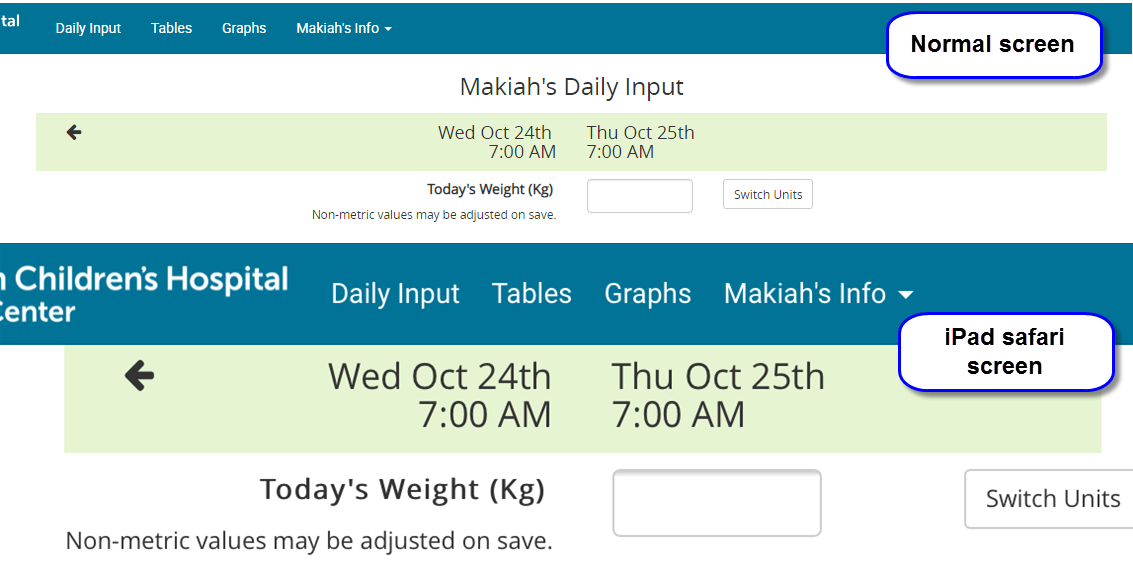
We are using bootstrap v3. Here navbar and container-fluid are having position:fixed;
Following are .main-container properties,
position: fixed;
bottom: 0;
overflow-x: hidden;
width: 100vw;
Not sure how to fix this issue just for iPad and iPhone safari? Any help is appreciate.
Aucun commentaire:
Enregistrer un commentaire